Composition – where a small adjustment can make the difference between good and great photos
Composition in photography is often what sets apart the good photographers from the great. In a world where equipment has become so advanced that anyone can take high quality photos with inexpensive gear, the ability to illustrate with a photo what you see with your own eyes is the most important skill.
In photography, as is in art, composition is the ability to show the details that you want, not show the details that you want left out, and authentically depict the interactions between all of the elements in the photo. If this sounds vague and theoretical, continue reading and learn how to take photos that will make people say ‘what a well-composed photo!’

Not everything you see will end up in the photo
Humans see things in a certain way – we have a wide field of vision, and we can quickly focus on pretty much anything. Notice that even though you have a wide field of vision, it’s only what you are paying attention to that is in focus (usually whatever is in front of our eyes). Without moving your head, you can focus on something in the periphery (but notice that your eyes are going to move to make that object centered).
.jpg) It works very differently with cameras. The frame is always rectangular (unless you use special equipment). You can focus on the side, the center, or the whole frame, and most importantly, only what’s in the frame gets in the photo. This means that if we took a picture of a kid in mid-air, that’s all we are going to see in the photo, not the rest of the story - the board the kid jumped from, the proud father standing to the side, the towel on the ground, etc. You can choose what you want to show and emphasize from the “story”, and what you want to leave out. If you want the picture to tell the story of the proud father, you need to include him in the frame (including the proud look in his eyes).
It works very differently with cameras. The frame is always rectangular (unless you use special equipment). You can focus on the side, the center, or the whole frame, and most importantly, only what’s in the frame gets in the photo. This means that if we took a picture of a kid in mid-air, that’s all we are going to see in the photo, not the rest of the story - the board the kid jumped from, the proud father standing to the side, the towel on the ground, etc. You can choose what you want to show and emphasize from the “story”, and what you want to leave out. If you want the picture to tell the story of the proud father, you need to include him in the frame (including the proud look in his eyes). You can even manipulate situations (by taking things out of context) to create shots that are powerful because they are out of context.
The photographer’s dilemma – which story do you tell? The kid is holding on to his father’s skirt. Would you focus on that or on the kid’s gaze?
The first rule of composition is to choose what’s going to be in the frame. Thus using the viewfinder is recommended for professional photographers and is better than using the LCD screen. The viewfinder is like a rifle’s sight in that it lets you focus on objects and identify what stays in the frame and what doesn’t. A trained photographer doesn’t only look at the center of the frame, but also at the sides so he can know exactly what will end up in the photo. He will move the camera up and down, left and right until he’s satisfied with what’s in the frame and what’s not.
Tinkering with the zoom can also help with composition. If there are elements in the background that you can’t avoid, you can let in more light and make them less visible by choosing a large aperture and a slow shutter speed.

These pictures were taken in the same spot, but are the result of different composition decisions made by the photographer. In the right photo there’s a clear focal point, leading line, and a more open zoom. The left photo has a clear focal point as well but it is a different one (the large rocks), causing this photo to tell a different story altogether.
Choosing a focal point
When you’re setting up the shot, ask yourself what is it exactly that you want to capture. Sometimes we see a great landscape and we just want to share with other people what we see with our eyes – an image. The experience is usually much harder to share.
Identifying a central object within this beautiful landscape will help the person viewing the photo focus on something and compare it to the surroundings. Try to identify a central object and see where it is positioned relative to other objects and relative to the background. Take the photo with a central object and without and you will see for yourself that the central object helps the viewer appreciate the photo and experience the spectacular landscape.
Many times the background behind the central object does not contribute anything to the photo. You can physically move closer to the object to fill the frame with it. The photo will come out more dramatic, even if in the process bits of your object get cut off.
Photographic interactions
 There are interactions in every photo. When there’s one main object, there is the relationship it will have with its background: is the background too blurry to emphasize the main object, does the object have any interaction with the background (such as in a photo of a man staring into the distance)? When there are several objects in the frame, the interactions are many: the boy is running towards the girl to play with here in the playground. Did we capture all the objects? Is it clear that the boy is the one running, or does it look like they are both running (the girl just happens to be running in the playground so it looks like she’s running towards the boy)? Is it clear that the playground is our backdrop?
Colors also play a role in photographic interactions. Is our object’s color very different from the color of the background (this will emphasize the object), or are they both of similar color (will assimilate the object in the background)? Imagine a photo of a well-camouflaged soldier standing in the middle of a jungle. The viewers will have to strain to see him, and will feel excitement when they finally do. Imagine the same soldier in the middle of the desert. The stark contrast between the soldier and his environment will also create a great photo.
There are no absolute rules when it comes to photographic interactions between the object and the background, but it’s within your prerogative to identify those interactions and illustrate them in the photo.
Your goal is, therefore, to identify the interactions among different objects in the photo. You can use any tool in your arsenal to achieve this: the aperture, shutter speed, type of lens, your location, and the time of day to capture the composition that you are looking for.
Lines and the composition they create
Lines in the shot significantly influence the resulting photo. Straight lines create a static composition, while diagonal lines create a dynamic composition (more on that further down). Lines can also set the perimeters of a photo, or pull the eyes towards a particular object. To clarify – we are talking about physical lines here, such as electric power lines that go through our shot, or a trail of breadcrumbs that lead back from the gingerbread house. It’s better if you spot these lines while you are shooting and not discover them after the fact.
Breaking the rules of composition – it can be a good thing
Despite the long list of rules, breaking the rules is also an element in photography. This is because every rule has an exception (even the exception has an exception, but enough philosophizing…) Over exposure, wrong use of focus, and other “mistakes” can create unique photographs that can tell an interesting story.
A novice photographer will always avoid shooting unclear photos and will be upset when the car he shot came out blurry, but professional photographers might use these ideas to capture an experience. That’s why breaking the rules above, and the rules coming up in this article (even the famous rule of thirds) can be the right thing to do.
Rule of thirds
The rule of thirds is a central rule in photography composition that says that you should place your object in one of the intersections of the (imaginary) lines that split the frame into thirds.
| | | |
| | | |
| | | |
Take the table above and think of it as a frame split into thirds. The rule of thirds says that the central object should be in one of the central square’s corners (which are a third of the way up, down, left, and right). The rule of thirds comes in complete contradiction to a novice photographer’s instincts to place central objects in the dead center of a frame. Click here to read more and see rule of thirds examples.
Leading lines
A leading line is an actual line (electric power line), or something we see as a line (a few rocks placed in a row), and it pulls the viewer’s eye through the image. A leading line is ubiquitous in landscape photography – a river that meanders and pulls the eye to follow its path, dramatic skies that lead the eyes from one side to the other. A leading line can be straight or diagonal, and even curvy. Click here to read more and see leading lines examples.
Framing
 When we say framing in composition we mean using objects in the photo to create a frame to our central object. An example would be an open window that frames the person looking out of it, a bridge and its pillars that frame a boat sailing beneath it, etc.
 A standard, uniform frame will work to highlight the object within it, but a frame that’s too dominant will pull too much attention to it and will become the central object in a photo. There are several techniques used to minimize the dominance of a frame:
- Light and shadows – shooting at an angle that will result in a dark frame, or the opposite – using the flash to brighten the frame, will reduce the dominance of a frame.
- Focusing on the central object – you can have your central object in focus and blur the frame through the correct use of the aperture and shutter speed.
Different types of compositions
Within all the kinds of compositions, there are some distinct types:
Static photo composition
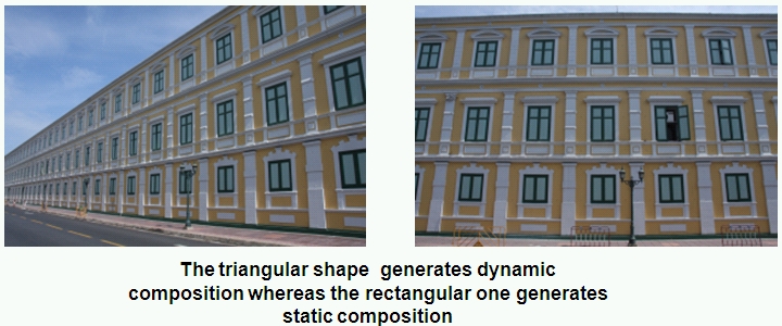
A static composition is where the objects are not moving or do not have any dynamic energy. A picture of a towering government building can be considered an example of a static photo (though flags flapping in its entrance can add a dynamic quality to it whether you want it or not).
Square elements with straight angles, or symmetrically arranged objects of similar size (like kitchen tiles) create a static photo composition.
Dynamic photo composition
Dynamic photo composition projects energy and movement. In the government building example, flags flapping in the wind, or a woman that’s opening a window in the building (if it’s clear she’s opening the window and is not gazing straight at the camera), will add dynamics. When choosing between static and dynamic composition, examine the movement and energy that your objects are projecting. You can emphasize their energy or go for a static photo composition, which will create a different effect altogether.
You can achieve a dynamic composition in several ways:
- Shooting objects that are in motion, such as a moving car or a running boy.
- Combining objects of various sizes that are laid out in disorder and are partially covering one another.
- Shooting at a diagonal line (diagonal lines give us a sense of movement and dynamics).
- Turning the camera as to not shoot the objects vertically or horizontally but somewhere in the middle.

The triangle shape projects dynamics while the rectangle is usually static.
Combining static and dynamic
You can combine static and dynamic composition by combining static and dynamic objects. The government building with the flags in the entrance is an example. You often see a static frame combined with a dynamic object. An example of that would be a man (a dynamic object) walking through his house doorway (a static frame).
Open composition
Open composition doesn’t tell the whole story – this is achieved by cutting off objects that are in the shot. For example, showing a man’s leg in the shot, but not showing us the man. This will prompt people to wonder, “Whose leg is this? How does this person look like? Is he looking at what’s in the picture?” In the picture at the top of this article, the girl holding on to her dad’s skirt is an example of open composition. The photo where her dad is fully visible is an example of closed composition.
Closed composition
Closed composition includes every single detail, and doesn’t leave anything to the imagination. The advantage of using closed composition is that the viewer does not need to think or imagine too hard, and, therefore, can put all of his energy into noticing the details in the shot (the wrinkles in the object’s forehead, his subtle smile, and any other detail you wanted to highlight).
Symmetrical composition
As the name implies, symmetrical composition is symmetrical. If there’s a central object, it’s in the center of the frame and is symmetrical (shot straight ahead, not in profile), and the background is uniform (the ocean on both sides of the object, the sky is on both sides of the object…)
Symmetrical composition draws the eye to the objects in the center, and converging composition is a type of symmetrical composition that pulls the viewer to the dead center of the photo (for example, by putting two twins looking from each side at their sibling that is standing between them, or roads in the desert crossing each other).